Podcast Typography Poster
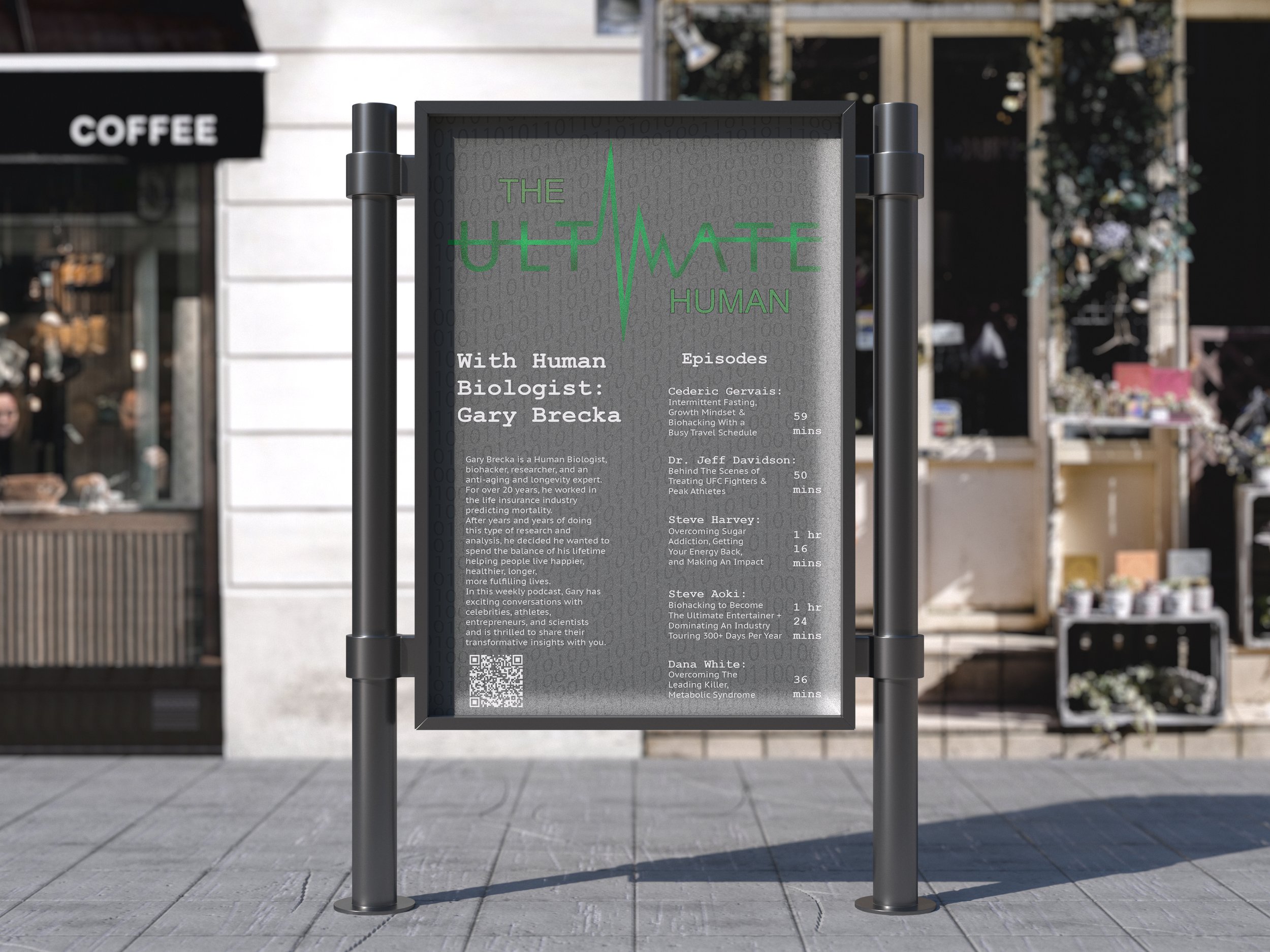
In this poster my color choices of green and gray were chosen to relay the vitality of a healthy lifestyle in contrast with the binary representing the endless system that wasn’t helping people in need. The sub-heading typeface Courier New was picked for its ability to remind the viewer of old typewriter documents like military and medical records as another way to inform the reader of what the podcast contains. The main title of the poster is an electrocardiogram wave in combination with the word “Ultimate” as a way to provide emphasis and to inform the viewer of the health based genre of the series. For my updated version I limited the typefaces to two styles, relying more on hierarchy to set information apart. This combination of simplified text and changing the body copy to white helped make the whole poster more dynamic.