Poster Fold Design
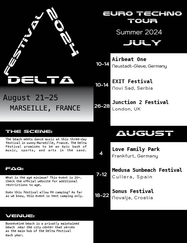
This was the second time I truly attempted to plan and execute a layout. This project really opened my eyes to what I needed to look for in that capacity. When my first attempts were critiqued I was able to get a stronger idea of what worked and what didn’t. I was able to explore new typefaces that complemented my techno music genre choice such as Laserian which makes up the sub-heads in the last couple of poster fold interiors. Finding a use for Laserian made the interior feel a sense of cohesion between layout and poster. The challenge of reworking this first project with all that I’ve learned has been a really gratifying experience.


Process Work

These early versions were done in color and converted to black and white. The desaturated grays made the layout bland.
Before Revisions

After Revisions

Working in black and white from the start showed hierarchy much better contrasting images.